It’s no secret that product quality and customer service are critical to success in retail and fashion. Store layout, however, can also have a huge impact on customer enthusiasm and retention. This is true not only of permanent locations, but also for pop-up marketing efforts, in which initial in-person impressions can play a significant role in both immediate and long-term sales.
Most shoppers are completely unaware of the extent to which basic psychology plays in their decision to purchase one item and reject another. Their buying behavior can easily be shaped by in-store environments, which should be constructed to feel as appealing and as natural as possible.
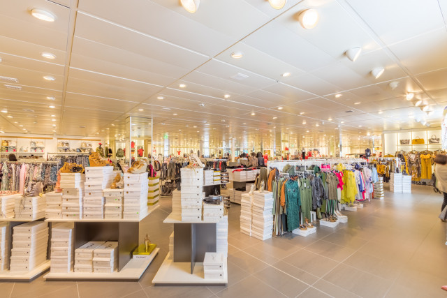
No matter the nature of the store, it’s possible to create a strong impression by implementing these store design tips, which draw on the power of visual merchandising:
Provide an Inviting Space for Decompression
No matter how stressed customers feel as they enter a store, the space near the threshold should place them at ease. Commonly referred to as the decompression zone, this area helps customers transition into shopping mode. Visitors are often distracted by their purses or smartphones as they enter this space, so avoid placing anything essential here, as they might miss these items or displays completely. This is not an ideal space for carts, baskets, or key marketing messages.
In addition to helping customers shift their mindset, decompression zones should encourage them to slow down. If they enter the store feeling rushed and continue to maintain harried pacing, they aren’t likely to notice beautiful displays situated elsewhere. Calm and comfortable threshold regions set the tone for a successful shopping trip.
Create a Power Wall to the Right
Where do customers turn when they first enter a store? In North America, the vast majority immediately gravitate towards the right side of any given location, regardless of what is displayed there. After they’ve passed the store’s threshold, they will quickly look to the right side of the store to provide an immediate first impression. This natural behavior provides the perfect opportunity to captivate consumers with the most impressive merchandise available.
Known throughout the retail industry as the ‘power wall,’ the space found to the customer’s immediate right should be carefully designed to instantly convey a store’s brand and purpose. If consumers are unimpressed with this area, they may choose to abandon the store altogether.
Power wall strategies can vary dramatically from one location to the next. Often, these depend on overarching marketing approaches. For example, a high-end boutique may use this space to display the most fashionable items in stock. In other stores, this valuable real estate is best utilized for seasonal merchandise, which may attract the most immediate attention. Some brands take an alternate route and use this space to tell stories in hopes of building a stronger, more resonant connection with customers. Regardless of the purpose of the display in question, this area should be visually appealing.
According to Johnson & Wales retail professor and online instructor Kristen Regine, strategically placing items in this area can also make for a big boost in customer traction. “Placing your sales items toward the back right of the store encourages the customer to keep walking,” she said.
Develop a Path Through the Store to Maximize Exposure
After customers have turned to the right and observed a power wall of impressive merchandise, they will ideally be led through the store via a path featuring racks, shelves, tables, and other implements. Don’t give them the opportunity to think about where they will go next; the process of navigating the store should feel natural.
In most cases, a circular path is best, as it leads customers through as much of the store as possible while also making them feel in control. The greater the exposure to various products, the more likely consumers are to find items worth purchasing. Typically, store paths lead customers in a counter-clockwise direction.
While customers should feel compelled to walk through the entire store, they will also appreciate opportunities to take occasional breaks and explore products in-depth. Excessively long aisles or pathways will quickly bore them. Instead, break up aisles with intriguing displays that encourage visitors to stop and relax.
Make Merchandise the Star
Avoid the urge to draw excessive attention to fixtures, which will do little to impress consumers. Rather, fixtures are more likely to distract store visitors from the true star of the show: the merchandise.
When possible, let fixtures fade into the background while still ensuring that they successfully highlight key products. The occasional use of specialty fixtures is perfectly acceptable for improving aesthetic appeal (especially in high-end stores) but in general, the main goal should be to attract the eye to important products.
Also, Regine says a big part of making merchandise the star is to make sure customers can actually see it. “Another visual merchandising pointer is to place items at eye level where customers can see them,” she says.
Allow Customers to Continue Shopping During Checkout
The process of shopping should continue even after customers have wandered the entirety of a store. While the ideal checkout experience will be quick and seamless, a longer wait can provide a powerful opportunity for making additional purchases.
Consider the placement of candy bars, gum, and magazines at grocery store checkout aisles; these items are notoriously difficult for the average shopper to resist. In other stores, the space immediately in front of or behind checkout counters can be used to highlight visually-appealing and easy-to-buy items.
According to Regine some companies already do this better than others. “Think brands like Old Navy and TJ Maxx,” she says. “They include an array of merchandise as you wait in line.”
Change Displays Regularly to Create a Fresh Feel
While basic layouts should remain consistent to make the most of natural customer tendencies, the actual merchandise displayed in specific areas should be swapped out on a regular basis. Customers crave novelty. They are less likely to return if they know exactly what to expect. New displays are particularly critical along power walls, but they will ideally be incorporated throughout the store to keep customers interested for the entirety of their visit.
A strategic retail store layout can dramatically improve customer satisfaction and sales figures. Don’t miss this opportunity to get both new and returning visitors invested in your brand; even small tweaks can transform initial impressions and long-term customer behavior.
If you are considering a career in merchandising or retail, learn more about earning your bachelor’s degree in Fashion Merchandising & Retailing. For more information, complete the Request Info form, call 855-JWU-1881, or email [email protected].